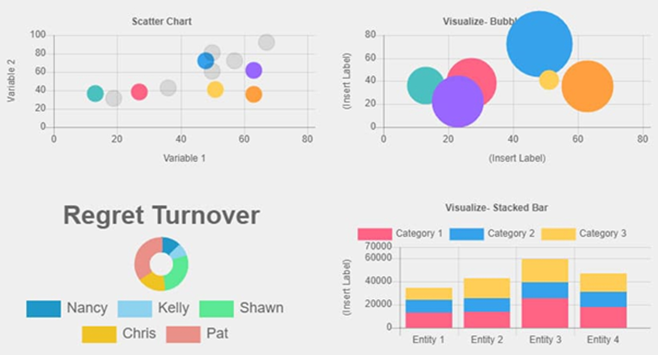
Tips to Get the most out of your Interactive Data Visualization
Data visualizations are not as easy to create. All the right elements need to be present in the right balance. At the same time, specific errors need to be avoided to build a meaningful visualization.
Here are essential data visualization tips to take your visualization game up a notch!
1. Being Audience-Specific
While designing data visualizations, it is crucial to know the necessity of the chart and the audience. These two things alone can take your visualization from nothing to insights. This assures that you build a visualization with a strategic direction that answers a precise question and one that the audience can quickly grasp. Bombarding your chart with many trends will most likely split the viewer’s attention and defeats the idea of the visualization.
2. Picking the Correct Data Visualization
There is a variety of visualization graphs and charts out there. But picking the right one is essential to highlight the critical trend in the data efficiently. Also, picking the correct chart for your visualization will ensure the information is easy to understand and the viewers are drawn to your work. Each design has a distinct purpose, and one should know where to apply which graph.
3. Keeping Visualization Simple
It is very easy to put up too much data in a visualization. But tough to get rid of irrelevant data. A minimalist visualization devoid of distress and random patterns is likely to convey the viewer more efficiently. The visual elements in a graph that are not relevant in helping the viewer understand the graph’s information is called Chartjunk.
4. Effective Color Utilization
Everyone knows the influence of colors and the measure of impression they can have on the viewer. It is one of the most critical data visualization methods that you can use for your visualization. It can provide the right amount of zing that your visualization requires to attract the viewers. But inappropriate use of colors can end up deceiving the viewer. Therefore, the data visualization technique demands close inspection.
5. Interpretable Data Visualizations
Visuals are only valid if they don’t change the message to the viewer. The interpretability of the visualization weighs more than its visual charm. All the above points make the visualization more interpretable. In the end, even if a simplistic line graph can deliver the message across to the viewer, you don’t need to put intricate logos or images in your visualizations!
6. Data should be Suitable for the Story
Do not produce a visualization just for the sake of it. The last tip is to ensure that the data you want to apply is suitable for your proposed application. Your data needs to tell the content and not the other way around – don’t try and force-fit a visual method to a story.